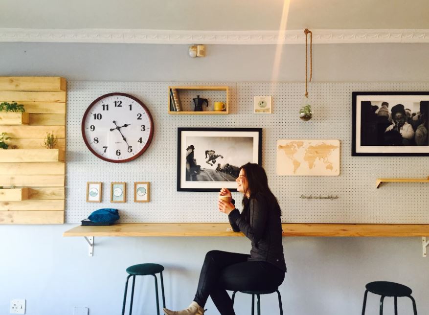
Have you ever walked into a cafe and felt immediately calm and at home? That kind of cozy and welcoming atmosphere is no accident, and it starts with the careful selection of colors for the space. The right color palette can evoke emotions, set the tone, and create the perfect ambiance. This article will go through the best colors to paint your cafe, their psychological effects, and how to incorporate them into your design.
Warm Colors for a Cozy Atmosphere
Warm colors such as red, orange, and yellow can make customers feel cozy and welcome. They stimulate the appetite and are ideal for cafes and restaurants. Red is a daring color that can grab attention and spark excitement. It’s associated with feelings of love, passion, and energy. Orange is a cheerful color that can command attention and create enthusiasm. It’s related to feelings of joy, fun, and happiness. Yellow is a warm color that can make customers feel welcomed and comfortable. It’s associated with feelings of optimism, confidence, and friendliness. You can browse a paint store like Norberg Paints to see the various hues within each of these color options. Consider using warm hues as accent walls or smaller details rather than the primary color in the space.
Cool Colors for a Tranquil Environment
Cool colors such as blue, green, and purple are ideal for cafes meant to offer a tranquil atmosphere, perfect for those who want to work or read while enjoying their coffee. Blue, in particular, is known to help lower heart rate and blood pressure, which is why it’s a popular choice for many cafes. It’s associated with feelings of calmness, serenity, and trust. Green is a versatile color that can evoke feelings of freshness, balance, and harmony. It’s associated with nature and the outdoors. Meanwhile, purple can create an atmosphere of luxury and sophistication. It’s related to feelings of creativity, imagination, and power. A general rule for using cool colors is to ensure they’re not overpowering in the space, and they are balanced with warm toned materials to create contrast.
Neutral Colors to Keep it Simple
Neutral colors such as beige, white, and grey are versatile and timeless. They can serve as a backdrop for other colors to create depth and can work within any design style. Beige is a warm, inviting neutral color that can create a calming and comfortable ambiance. White is ideal for providing an open, clean slate, especially when used for walls, which can give the impression of space and airiness. Grey is a timeless and elegant color that can convey sophistication and serenity. It pairs well with most warm colors and can be a great transitional color choice in between different areas of the cafe.
Creative Accents to Bring in Energy
Using accent colors such as bright yellows, strong blues, and vivid purples avoids the cafe feeling dull and helps to cause a final impact on customers. Accents should be used sparingly around the cafe space to emphasize specific items – mosaic tiles with unusual patterns over an espresso machine, bar stools of different hues, or even colorful abstract art pieces can also add a touch of energy to a space without being overwhelming. By nailing the tone of the accent color to the cafe through an accessory, it can trigger corresponding creativity and relaxation by the customers who visit the space.
Lighting’s Role in Color
Lighting plays a big role in how customers experience color in cafes, and it can be used to enhance the displayed color tones, increase contrast, and brightness levels. Natural light can make warmer colors feel even more welcoming, and cooler colors more calming, while artificial light can be utilized to emphasize specific decor elements by targeting main lighting fixtures featuring specific hues, therefore, highlighting certain colors to their full potential. If your cafe is illuminated with industrial-style fixtures, track lighting or pendant lights, you can supplement it with warmer-toned lights which can add dimension to the interior, providing an increase in color richness and depth.
Design is an essential aspect of any cafe business, especially when it comes to color selection. By selecting warm colors, customers are likely to stay longer and feel more content; cool colors can create more tranquility and less chaos, while neutral colors tend to provide a timeless and versatile backdrop for other colors. With the use of color, accents, and lighting fixtures, the cafe can create an inviting and welcoming environment that invites customers to relax, stay a while, and enjoy their coffee. While choosing the perfect color palette may take time, it’s worth the investment to create a space your customers will love to spend time in.
